


Live, Laugh, Lucinda: principles of designing with text
Yes you could have also made this, but you didn't


Adam here…
Maybe it’s the live, laugh, love of it all — my inner southerner yearning for a world of kitschy sayings on dish towels — but I love text. Particularly intriguing to me are text-based objects, practical items like art, jewelry, and clothes. When used properly, they can be fun, chic, and a signifier that you don’t take yourself too seriously. I think there are a couple key principles to consider when working with text.
A). Too much of a good thing = a bad thing. It’s better to use text sparingly. Being selective with where you place text (within interiors or outfits) clarifies focus. Less text keeps us wondering, a good conversation starter.
B). Pair text with contrasting items. The required contrast will depend on the style and message of the text. Any successful aesthetic endeavor typically involve some sense of balance — high vs. low, uptown vs. downtown, elegant vs. hip.
C). I prefer text to have a slight edge, either in message or design. Too sweet and it borders on gauche. Handwritten text will always be better and would be the only exception to the edgy rule. Ironic or subtly cheeky text is generally best.
For you visual learners, here are some examples. If included, I endorse it.

Campy. The team at Eva Joan are the queens of cheeky text.

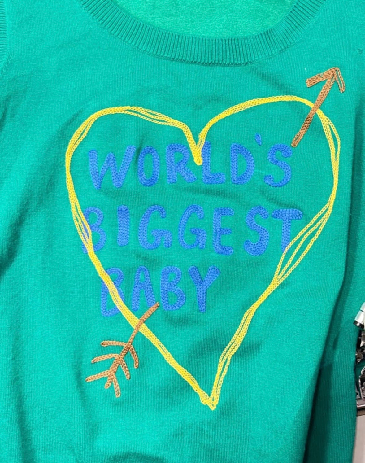
Needs to be paired with solids or stripes to be successful. Anything else too graphic would compete. Could be cool with an all denim fit. Throw in a sleek pinky ring for sure measure.
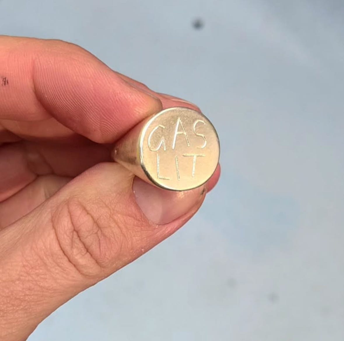
Funny, yes. Mysterious, a bit. Conversation starter, definitely.

Hidden text is superior. Think: love notes engraved in rings and sewn inside jackets.

The mixed size wood planks balance the silliness of the art, completely different than if it were hung on a funky wallpaper. It could work, but would probably to be too much. I recommend hanging this art alone for maximum impact.

The chalky hand-writing and backwards “S” in line two make it.

The phrase is funny and edgy, and the pink (not too sweet) is expertly balanced with rough texture and stitches. A piece screenshotted via art advisor Illa Gaunt that would be the perfect foil to a more buttoned-up interior.
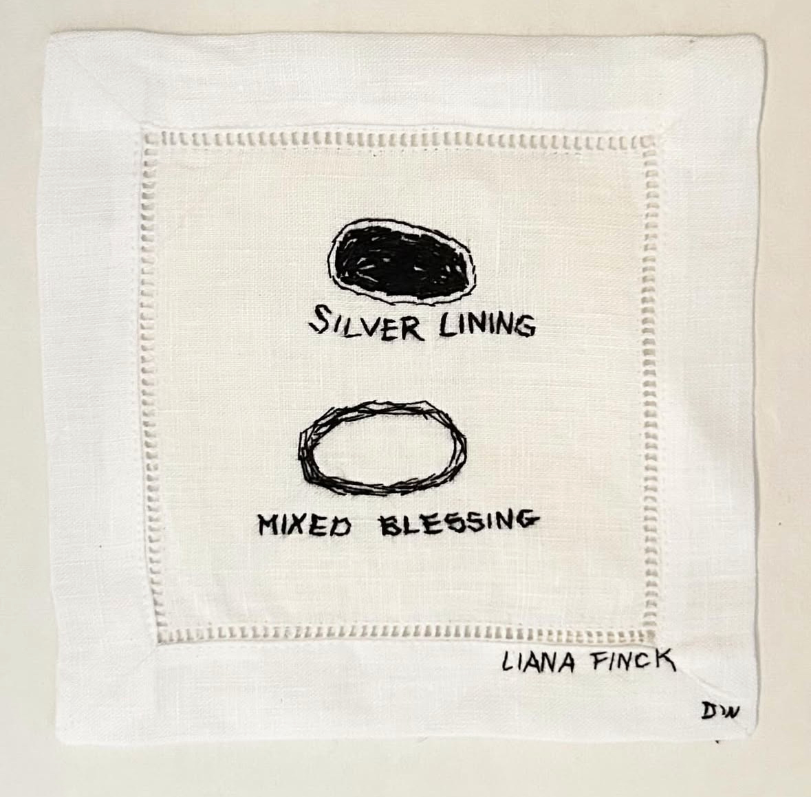
It’s hard to go wrong with personal, regardless of style. A framed note from a friend, kids’ handwriting sewn into a napkin, or a hand-drawn cartoon tacked up in the kitchen are all wins in my book.

The style of cursive is not too elegant, keeping it from leaning too sweet. The repetition of tick is a bit mysterious and, from a distance, give the piece an abstract quality. Notice how the text is not perfect — spaces between the words on the top two lines, the last tick of the first line crunched and cascading down the side, and the missing “k” at the end of the third line. It’s hard to explain. It’s just cooler that way. More hand-made, less mass market.

This is an interesting example as I think the labeled bins alone could border on suburban. It’s the coordinated palette of towels and red basket coupled with the sharp architectural millwork by Bories & Shearron that make this work. Special note: the towel styling is not too neat. Five towels work better than if there were six, as odd numbers always do. The one pink towel (instead of two) keeps it from feeling formulaic. The sharp color of the red text also holds it own in a way that a sweeter color might not.

Another cursive example, I like that it’s not too pretty. Extra loops in the “W” would not have worked as well. The word is also a bit mysterious. Is this the name of the house, an inside joke, an adjective? Fun for a guest bathroom.

Chic and bold, the sleek shape of the pitcher helps. The specific addition of “iced” makes this somewhat ironic/ funny to me. Pair with our favorite mouth-blown glassware and a plate of citrus and you’re set.

Low budget solution. Write names on rocks and display as part of a collection. Manmade balanced with the natural.
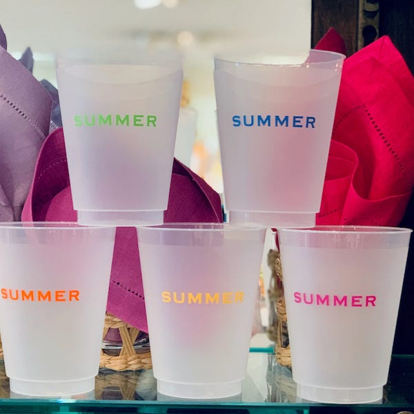
Full disclosure: these cups from East Monogram shop are not the ones I wanted to include. They used to sell cups that said “summer water” and I much prefer those. Again, the denotation that they are specifically for summer water is cheeky and what does it for me.

Checking a bag is the bane of my existence, but if you must, this is funny for waiting around the baggage carrier.

IZ U? Not anymore. Hopefully, these examples have opened your eyes and encouraged you to notice text in greater detail. Remember: less is more, balance, and edge. Don’t overthink it. It was never that serious.

Live, laugh, later. More screenshots soon.
Adam